Sunday, December 6, 2020

Hanging in there, and there...


Hey folks, I hope you are all doing well, hunkering down, masking up and staying focused on protecting yourself and your loved ones as the winter weather sets in for real. It seems the least we can do for our heroic, beleaguered front-line health care workers is to take care to stay healthy. So far we are OK.

If you've wondered about my social media slump in recent months, it's mainly to avoid too much negativity. And although I truly believe that all creative arts are good for the soul, lately the challenges are so great that it seems a bit trivial. 

However, my work is currently in a show that not only highlights fine art but also benefits a variety of charities in Westchester County so it feels good to mention it. For 48 years St. Matthew's has held Art Show Bedford to raise money for local charities in Westchester County. They have done so much good, supporting charities every year, that it feels good to have been part of this effort again. This year the exhibit is online and I have eight paintings included. You can see my work here and also the work of many fine artists who enjoy giving back to our communities - including my friends Leslie Carone and Laura Gould! There is also an impressive list of the 14 charities who will benefit from the proceeds of art sales.

Here are three of my eight paintings at Art Show Bedford.

flow blue china, heirloom tomato
Heirloom & Antique ©2020 Dorothy Lorenze


Flow blue china, blue cheese still life painting
Blue on Blue ©2020 Dorothy Lorenze

Red spring onions, still life, fresh produce
Baby Red Onions ©2020 Dorothy Lorenze

I am also pleased to say that two of my paintings are on exhibit at the beautiful Mark Twain Library in Redding, CT. This is always a beautiful show! It runs from Dec 5th to Dec 13th and, this year, you can see the work online as well as in person. Paintings are listed alphabetically by title and mine are Chick Please and The Regiment.

vintage diner, restaurant check, chick
Chick Please ©2018 Dorothy Lorenze


shaving brushes, vintage barber, original art
The Regiment ©2020 Dorothy Lorenze

If you're wondering about the art world in our new home state of Massachusetts, well, I have connected with several arts organizations. Of course it hasn't been so easy since more than half of the year that we've lived here has been during "the great Covid19 pandemic" (not so great, but you know what I mean). So I'm very pleased to have won awards at the Boston Guild of Artists, Newburyport Art Association and Rockport Art Association and Museum! Currently my painting Plum Regal is in the Annual National Exhibit in Rockport and it's a truly gorgeous show! And Pepper Pile is at Newburyport.

textile pattern, plums, still life
Plum Regal ©2020 Dorothy Lorenze

peppers, still life, original fine art
Pepper Pile ©2020 Dorothy Lorenze

Lastly I want to say a belated Happy Thanksgiving to everyone. I feel blessed to have been able to celebrate with our small family pandemic pod in MA and look forward to seeing the rest of our crew - hopefully in the near future. It's been hard to be apart but I am grateful that we are all healthy. I also appreciate all the good wishes and support of so many art lovers and artist friends who continue to create,  making this world a more beautiful place for us all! Stay healthy, my friends!


Sunday, August 30, 2020

Painting details

Composing a painting is hard. I'm usually inspired by an actual object, but inspiration can also come from the desire to capture a particular texture, finish or light effect. And as happened here, even the simplest subject (plums) can become complicated.

This latest painting started in the produce aisle where red-purple plums were looking rather regal. In my studio, while figuring out how to highlight their glory, they sat in a spatterware pie plate. Not exactly regal, but spatter grey against glossy purple made a nice contrast. So that was the start of what was meant to be a horizontal painting starring purple plums. 

And then this happened.

plum still life, vintage tea towel
Plum Regal ©2020 Dorothy Lorenze

A simple portrait of produce became a regal throne of intricate tapestry. Well, maybe just plums on a tea towel, but certainly elevated by the rich pattern. Really, the complimentary colors of green-blue and red-purple were just perfect. So... what to do about that fabric pattern?!

A detailed drawing is almost always my starting point. For this painting I focused on the plums and the ellipse of the pie tin. Figuring I'd do a looser impression of the fabric pattern, and kind of wing it to avoid being too mechanical.

Realism is challenging, of course, and involves training your eye to see the small details that will add to the interest of the painting. It can also mean training your brain to ignore some degree of detail to maintain the poetry. So I gave myself permission to be not entirely literal with the fabric while still creating a level of realism that felt right, to me. That meant drawing the fabric to provide key shapes and elements of the pattern to be a road map for painting the pattern. 

fabric pattern

More detail than just winging it and less than photo accuracy. In the end it did not feel like a compromise, but a successful rendering of my vision. And that's a great feeling.  

I drew, but, also used photos to check my work. There are artists who work strictly from photos and those who believe that's cheating. My feeling is photos can be a tool, not the same as personal observation - which is OK when you know how photos can flatten images and effect color. I don't want to be so literal that I miss the personality of the subject. Artists have different backgrounds and different goals, and that's fine. As Karen O'Neil used to say, "There's no right or wrong. There's only what works and what doesn't". 

I drew the plums and the pie tin as accurately as possible, focusing on the ellipse of the tin and positions of the plums front/back, above/below one another. Then transferred the drawing to the painting surface. You can see an example of this process here

Things were going along ok but the pie tin wasn't quite right. So I took a photo of the painting, marked the center axis of the tin and folded it to see if it was symmetrical. The left side looked more accurate to me so I cut through the folded pieces which slightly reshaped the right side to match the left. The depth of the tin had been off slightly causing the angle to be sharper and that made the difference. You can see this on the right side of the cut printout - very hard to visually measure!

checking symmetry
checking symmetry

Checking symmetry this way helps separate what your brain knows from what your eyes see. When drawing a symmetrical object on paper you simply fold it in half, use backlight to see if the sides align. You can't do that with canvas, hence the photo. (This can also be accomplished with a tracing, but the painting was wet.)

At this point the fabric was looking more sloppy than impressionist. So I made a greyscale image of the painting to help determine how stark or subtle the contrast was in the fabric pattern. I could see that not only were the thread colors closer in value but there were variations throughout where the light hit differently. This helped to make the fabric more natural and realistic.

vintage tea towel, plums, contrast
comparing values with a greyscale image

I was still at the ugly duckling stage of this painting - a time when its easy to get frustrated or lose confidence. But on this day my audio book was ... a bit different. It was the story of David Goggins, Navy Seal, USAF Tactical Air Control and ultra athlete. Don't laugh, but I was inspired. 

Goggins came from an abusive background where he always felt like a loser. After many personal disappointments, he challenged himself, stopped making excuses, worked hard and never settled. It's a raw story and I can't exactly recommend the totality of it. However, I will say, it's hard not to do your very best when his voice is in your ear! 

Thank you for joining me on my art journey and please share these posts with those you feel might enjoy them. If this post was shared by a friend, if you like, sign up on my website to receive monthly newsletters from my art studio. 


Friday, July 3, 2020

Interdependence Day

Does anybody know what day it is? Perhaps not. Fortunately I have help with my calendar as two of our grandchildren come for weekly playdates. Otherwise we'd have no sense of time... and far less laughter! 

But I hear July 4th is coming.

This year Independence Day might feel more like Interdependence Day. We're all in it together... apart. Thankfully, folks around here are generally considerate - maintaining safe distance and wearing masks in public.  While we may be cranky about restrictions, I feel pretty fortunate overall. 

Artists are generally comfortable with solitude anyway. I love the quiet of my studio, where my mind is somehow settled and invigorated at the same time. There are many ups and downs in painting and it's a good day when the ugly duckling stages are balanced with satisfying moments. But art-making is a little like the tree that falls in the forest - more fully appreciated when it's actually witnessed. 

So I love hearing how a piece resonates - the story about a feather painting connecting a young woman with her grandmother or a vintage object bringing a warm nostalgic moment to mind. Which brings me back to "interdependence" on this Independence Day. Most often I'm painting for the challenge of rendering a subject in an interesting and skillful manner, but the icing on the cake is knowing how a piece impacts others. And I thank you all for that perspective.

Here are some recent red, white and blue paintings for this July 4th. I've been on a roll painting beautiful  flow-blue china in our new, old house. All were fun and challenging but I think I enjoyed Blue on Blue the best. And I don't even like blue cheese!

If you'd like to learn more about these paintings click on the images for the link to their website page.

heirloom tomato, flow blue china, still life
Heirloom and Antique ©2020 Dorothy Lorenze

ripe tomato, flow blue plate
Juicy & Blue ©2020 Dorothy Lorenze

Blue cheese and flow blue china
Blue on Blue ©2020 Dorothy Lorenze

Baby Red Onions came about because I saw these beauties in the produce section and loved the way the shiny white bulbs, stained with purple-red striations, contrasted with the translucently, water-filled, green sprouts. Fascinating textures to capture. Onions were not on my list that day but we take inspiration when it comes.

red onions, baby onions, still life
Baby Red Onions ©2020 Dorothy Lorenze

The week when there were virtually no eggs anywhere I found a small box of delicate, pale blue eggs. Six local heirloom eggs. They were probably delicious, but of course we never tasted them since they were unrefrigerated for days while being painted. The bowl in this still life is one I've had for awhile. Even though it's actually contemporary, I love it for its Art Deco meets Neoclassicism collaboration. I call the painting Scrambling, in deference to the crazy times we are living in. I'm honored that this painting was purchased as a house warming gift. It's hard enough to buy/sell a house without being in pandemic isolation! How special that my painting was bought to celebrate folks moving closer to family.

pale blue eggs, vintage china bowl, still life
Scrambled ©2020 Dorothy Lorenze

There have been several pandemic painting purchases lately. Here is a happy art collector who treated herself to some art as "home improvement" during isolation (safe, socially-distanced delivery by my daughter).
 
art collector with painting
Orange and Ginger ©2020 Dorothy Lorenze

Another recent sale was made to someone who had seen my work in an art exhibit last fall and eventually found me via the event organizers. He had missed out on buying a painting and couldn't quite forget it. So now he has purchased Rosy Nosegay and commissioned two others. That's dedication - and I'm so appreciative of the interest, and effort!

rose bouquet, silver pitcher
Rosy Nosegay ©2020 Dorothy Lorenze

And lastly, today I heard the good news that, with the acceptance of my painting Chicks and Balances, I was awarded the status of Elected Member of Allied Artists of America. I'm honored but also just happy for the painting's sake because it was a favorite of mine and I'm tickled that it was recognized. I don't know if that sounds weird, but think of it as being proud of your kids' successes.

1920s pottery, ceramic chicks, vintage scale
Chicks and Balances ©2020 Dorothy Lorenze

So, I haven't been to an art show, exhibit, museum, arts organization or casual art talk with artist friends in... months. And it feels pretty weird. We all are missing the sort of routine activities and relationships that are easy to take for granted. Here's hoping the "new normal" will return to the real normal soon. Who would have thought we would still be at home after four months. It's quite unimaginable, and yet, pretty much doable. Meanwhile, I'm still painting. I hope you are enjoying some kind of summer fun!

Thank you for joining me on my art journey and for weighing in with your comments and questions. 

Take care. Stay safe. Be kind. Be creative!

Saturday, May 9, 2020

Making time for art - in the land that time forgot

For most of us there is very little that is "normal" about our day to day life this spring, With that in mind, and with Mother's Day coming, I want to shout out to all the Moms and Mom-assistants who are finding creative ways to entertain, inspire and teach their kids. Those who are able to meet daily challenges, spark inquisitiveness... and still manage to maintain sanity. I hope you all enjoy a little rest and a good bit of adulation this Mother's Day. You deserve it!

As an artist, this stay-at-home isolation is kind of normal: time at home = studio time. And while I wouldn't wish the reason for quarantining on anyone, I'm making the most of it. After last year's lengthy distraction of preparing to move, I was ready to be more productive.

Here are some of the pieces I have been working on since February. This is Sweeney Todd's Curtain Call. It's part of a series of vintage barbering tools that I'm enjoying painting. Vintage implements like these, with their delicate craftsmanship, just fascinate me and I was lucky enough to borrow some antique razors and shaving brushes from a friend's extensive collection.

It was difficult to create a composition that highlighted the razors but eventually I hung them inside a wine box and played with the light to capture the character of their handles and the shine of the blades. And since it looked like footlights on a stage, the title seemed obvious. If you are interested in this painting, please take a look on my website for more details.

Vintage straight razors, shaving razor
©2020 Dorothy Lorenze, Sweeney Todd's Curtain Call

Another in this series is The Regiment. An assemblage of shaving brushes standing at attention with touches of regimental red and blue just struck me as having an esprit de corps. This painting is 10 x 10" and is also available on my website.

still life, vintage barber brushes, shaving brushes
©2020 Dorothy Lorenze, The Regiment

Next came a composition where one of the group had something of a downfall. Maybe the red background suggests a conflict? This little painting is called Man Down (obviously). It's 6 x 9". All these paintings are done on panels and all are sold framed in classic plein air frames.

still life, vintage barber brushes, shaving brushes
©2020 Dorothy Lorenze, Man Down

The barber tool paintings became a series because, although I was prepared to return them to New York in February... suddenly no one was going anywhere. I've been making good use of my extended time with these beautiful tools of the trade. The paintings below have already found new homes. Left to right they are: Family Resemblance, Blood Money and Vintage Barber Brushes.

©2020 Dorothy Lorenze
For a change of pace, and maybe more timely in subject, this painting is a composite of photos taken in Aix en Provence a few years ago. The impact of the light on the pillars and a child all alone created  a moving scenario but I hadn't yet been motivated to paint it. The time just seems right for this one and I call it Grace in Isolation. I hope you agree.

interior genre, church interior, light in church, original oil painting
©2020 Dorothy Lorenze, Grace in Isolation

During this difficult time when we are not only trying to stay safe, but, stay cheerful (!) it's been wonderful to see the creative ways folks are supporting one another - at a distance. I guess it says something about us all being in this together. Everyone's life has changed. We've followed rules, made masks, supported health care professionals, donated to communities in greater need and tipped grocery store cashiers. All the while being thankful for the privilege of having a home to shelter in comfortably and the loving support of friends and family. Gratitude and kindness - we need all we can get... and give.

I hope you and your loved ones are well and able to appreciate the goodness around you even on the most challenging days. As always, thank you following along on my art journey and for all the kind words of support on Facebook, Instagram and my blog/newsletter. I'll be back soon with more paintings to share. Hopefully we will see one another out and about very soon.

Take care. Stay safe. Be kind. Be creative!

Saturday, April 18, 2020

Painter, teacher, mentor...and author!


I try to be upbeat and art-focused in this newsletter and I hadn't planned to write about the state of emergency and dread that we are experiencing now, but it's impossible to ignore. And that's OK because we need to be both vigilant to protect one another and grateful for the beauty, love and generosity in our world. On the subject of beauty, I think of the beauty of kind, generous acts and, as always, art. 


I have been painting of course, and hope you are also finding something creatively beautiful to enjoy. The art of baking?! A dangerously delicious, creative endeavor. Actually, the art of cooking is especially creative lately: combining staples to limit grocery store visits. (Working from home since my graphic design days, I tended to head out in the afternoon for one red pepper... or a latte, if I'm honest.) Oh, and I made a few masks for protected social distancing.

For a more painterly approach to art appreciation, I am pleased to wholeheartedly recommend an utterly enjoyable and enlightening resource: The Art of Still Life, by my friend, teacher, mentor and all around go-to art guru, Todd M. Casey. It's a beautifully written and comprehensive book that will be of equal interest to artists and art lovers.


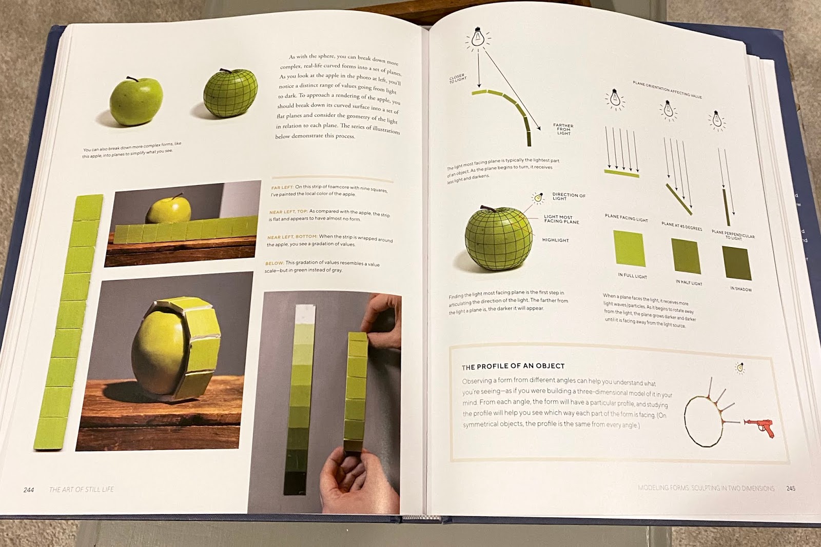
This book is filled with everything you need to know about creating - or appreciating - still life painting. Concepts of light, color, composition and so much more are explained, described and illustrated with images and charts making it easy to understand. Here, the drama of color falling into shadow on a form, an important concept, is clearly described. And there are so many others.

©2020 The Art of Still Life, Todd M. Casey 

But there is nothing dry about it. As Todd explains, "This book expresses both the scientific and expressive aspects of still life painting [and]... encourages you to heighten your senses and to use that heightened awareness when painting." It's inspirational as well as instructional.

In fact it was Todd's painting Bottles with a Book and Letters below that initially inspired me to reach out to him for instruction. The concepts in his book are those typically taught in a classical atelier - from color and value studies to cast drawing and rendering three dimensional volume in a two dimensional painting. Whether you have studied in an atelier program or not, this book is invaluable resource.

©2020 The Art of Still Life, Todd M. Casey
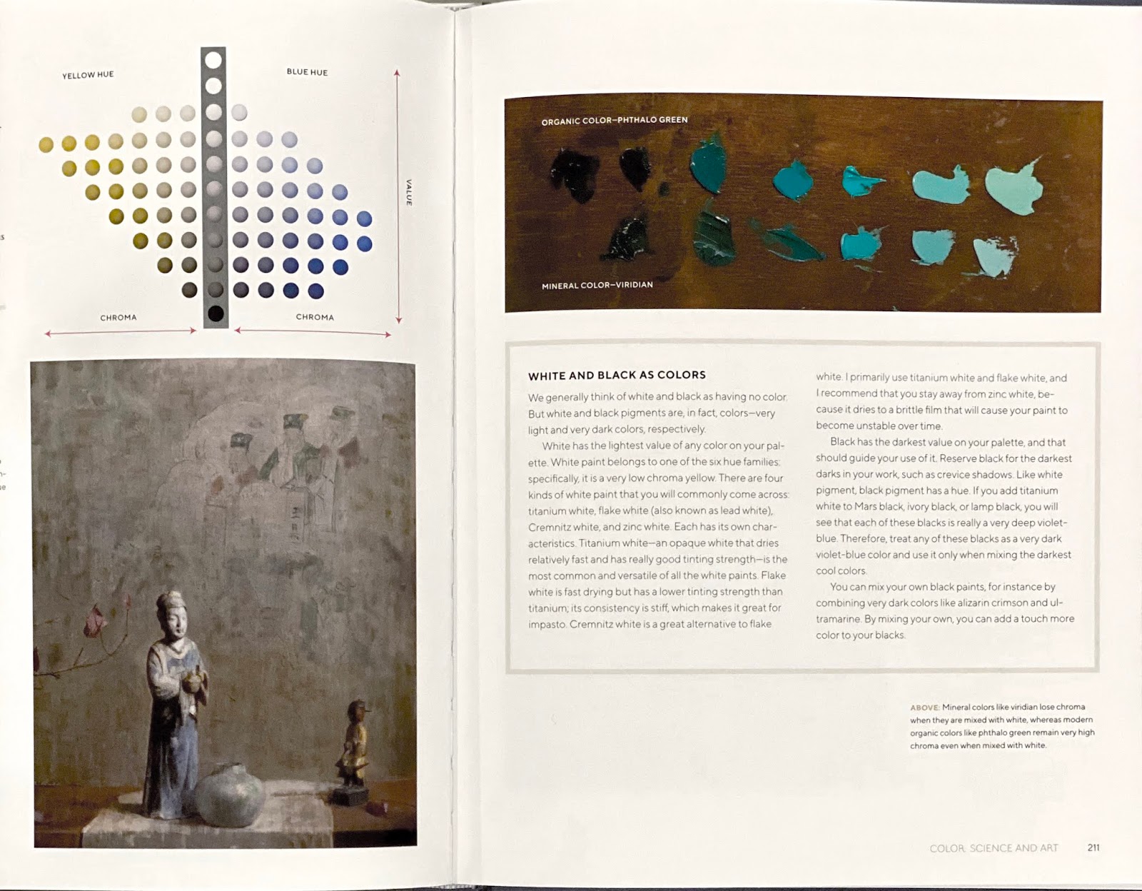
For me, the page below is a perfect example of instruction coupled with inspiration. An elegant, rich and subtle painting by Hovsep Pushman (which I had never before seen) illustrates an example of soft chroma along with a chart of oh-so-subtle color shifts flanking a row of neutral values. Just look at all the variations  between neutral and chroma and how effectively Pushman employs his subtle palette!

©2020 The Art of Still Life, Todd M. Casey
High quality images including historic masterworks and brilliant works by contemporary masters of painting are found throughout. My favorite juxtaposition of old and new is a trompe l'oeil by William Hartnet on the left and Tony Curanaj's contemporary version of trompe l'oeil. This historic genre of "fool the eye" paintings was made popular by Dutch painters in the 1600s and still holds appeal.


©2020 The Art of Still Life, Todd M. Casey
Many pertinent subjects are explored in The Art of Still Life including modeling form, perspective, foreshortening, organizing your studio - even understanding information on a paint tube! The chapter "Light, Illumination and Shadow" alone covers -
  • The Science of Light
  • The Terminology of Light and Shadow
  • Surface Reflection and Body Reflection
  • Light on Glass
  • Light on a Translucent Object
  • Light on Hair, Fabric and Wool
  • Lighting Your Studio
  • Thinking of Light Spatially
Don't know what it means to think spatially about light? No problem, it's explained and illustrated:

©2020 The Art of Still Life, Todd M. Casey
And below Todd shows how light is reflected differently on a matte, glossy or mirrored surface. Knowing this information adds to your conceptual knowledge making it easier to see and understand these differences in any composition. 

©2020 The Art of Still Life, Todd M. Casey
Although the book uses the genre of still life to illustrate concepts and methods of painting, all can be applied to any painting and there are examples of interiors (one by John Singer Sargent!) and gorgeous florals as well. Roses on the left is by Abbot Handerson Thayer (late 1800s) and on the right  is Paul Seaton's Old Roses, White Souvenir de la Malmaison and Glamis Castle (2008).

©2020 The Art of Still Life, Todd M. Casey
You don't have to take my word about the value of this book, Eric Rhoads, artist and publisher of Fine Art Connoisseur, agrees. His glowing review says, "It is one of the finest examples of a painting instruction book I've experienced in my collection of over 500 art books."  

In terms of a book review and recommendation, I guess I could have started and ended with that accolade... but you would have missed the pictures. And I would have missed revisiting it all too.

I will close with a personal accomplishment of which I am enormously proud: a few of my paintings are published in this book! Two are of basic sphere exercises that were utterly satisfying to paint. One is an image of my painting of cherry tomatoes with my palette adjacent. It's in the section discussing palettes. And my Dutch Apple Still Life painting is in the "Color Science and Art Chapter." Color me honored.

©2020 The Art of Still Life, Todd M. Casey
And a final personal note to report that our extended family is well and currently healthy. I truly hope this newsletter finds you well and healthy too. We have all been touched by tragedy on some level and are looking forward to a time of more mundane concerns. (Where should we go out to dinner tonight, my dear?) Meanwhile, as we manage emotions in this trying time, please be good to yourself. It's not easy to avoid worrying, so enjoy life's beauty wherever you find it.
Peace.

Once again, thanks for joining me on my art journey.

Sunday, January 26, 2020

New paintings, new inspirations

My most recent paintings have fallen into two categories: mandarin oranges and vintage barbershop. No connecting thread between subjects other than the creative process and the desire to explore imagery with both. Often while I'm painting I mentally cook up another composition with the same subject, so these have both developed into mini-series.

This painting, Mandarin Rising, was done last year and recently sold at Newburyport Art Association - my first local sale in our new home.

Mandarin orange, clementine, classical still life
Mandarin Rising (sold) ©2019 Dorothy Lorenze

I love painting the color and texture of these little oranges and had a backlog of composition ideas so was happy to see them again at Whole Foods. Here are the two latest, with different Asian elements to compliment their Mandarin-ness.

Clementine, glazed ginger jar, classical still life
Orange Ginger, 6x8" ©2019 Dorothy Lorenze 

Orange Ginger features a classic, green ginger jar with glazed highlights on the low-relief surface that contrast nicely with the flat, raw clay of the cover.

Clementine orange, vintage wooden box, opium cache, still life, original oil painting
Orange and Opium, 6x8" ©2019 Dorothy Lorenze

Orange and Opium requires a bit of explanation. The wooden box serving as a backdrop for the orange was purchased in a flower shop in San Francisco that had a variety of unusual containers and vintage boxes for floral arrangements. I like the deep red paint, scarred with indentations. Almost like someone tapped a hot circular object on it, like... say, an opium pipe?! Quite possibly, since inside the box was a slip of paper describing it as a 1920s opium box. I bought it in spite of its drug history and with fingers crossed that this treasure would not alert drug sniffing dogs at the airport. It's a great little box with a small sliding cover and a lot of character. I've got tons of ideas for compositions with this one. And I'm happy to say there was no drug-related delay at the airport.

The above paintings will soon be available on my website, which I am in the process of updating.

Meanwhile, Noteworthy, a trompe l'oeil "rack" painting, and Dutch Apple Still Life, a classic still life composition, are on view at the Newburyport Art Association. And I'm just tickled to share that Dutch Apple Still Life was awarded Best in Show! It also sold which is pretty exciting too, but what truly moved me was the kind comments by the juror. He described my piece as having "...the attention to detail one would expect from a Northern Renaissance master painting." Wow! He saw a connection to the very work that I admire most. And in fact, the pewter pot was bought in Amsterdam on a quest to bring home a Rembrandt-esque objet d'art for future inspiration.

I am so grateful to Newburyport Art Association and juror Jim Craig of Rockwell Art Association and Museum for this honor.
antique pewter, ripe apple, classical realism
Dutch Apple Still Life ©2019 Dorothy Lorenze
trompe l'oeil, vintage papers, antique desk utensils
Noteworthy ©2018 Dorothy Lorenze
The Newburyport exhibit is full of beautiful work artfully hung by the committee. They have enriched the viewer's experience by grouping sensitive drawings or fresh florals or colorful abstracts. Each a storyboard of complimentary imagery. Well worth a visit before it closes this weekend (February 1st).

In my next newsletter I plan to describe some of my painting process, showing stages of work in progress with the paintings I'm developing now. Stay tuned for more vintage barbershop a la Sweeney Todd, without the murderous bit.

Thanks so much for sticking with me on this art journey.

To the new readers: check out earlier studio news here where you can also search for past subjects. Please leave comments, ask questions and share this newsletter with anyone you think might find it interesting.